How UX, brand and content shaped an early luxury resale marketplace
Context
A new model for luxury retail
From 2013 to 2016, I worked as Art Director for a French startup pioneering online luxury resale. The company operated as a pure-player marketplace connecting buyers with both private and professional sellers.
The team was small — around fifteen people — which meant creative, marketing and technology worked closely together. As Creative Director, I led a small creative team and was involved in both the evolution of the brand and the design of the digital platform.
When luxury codes became a UX problem
At the time, luxury resale was still an emerging market. The challenge was not simply to make second-hand products look desirable, but to build trust around a new way of buying luxury online.
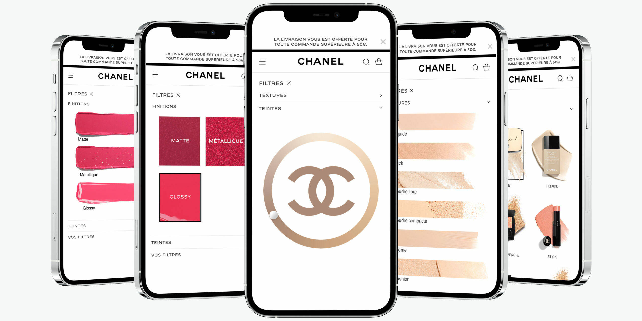
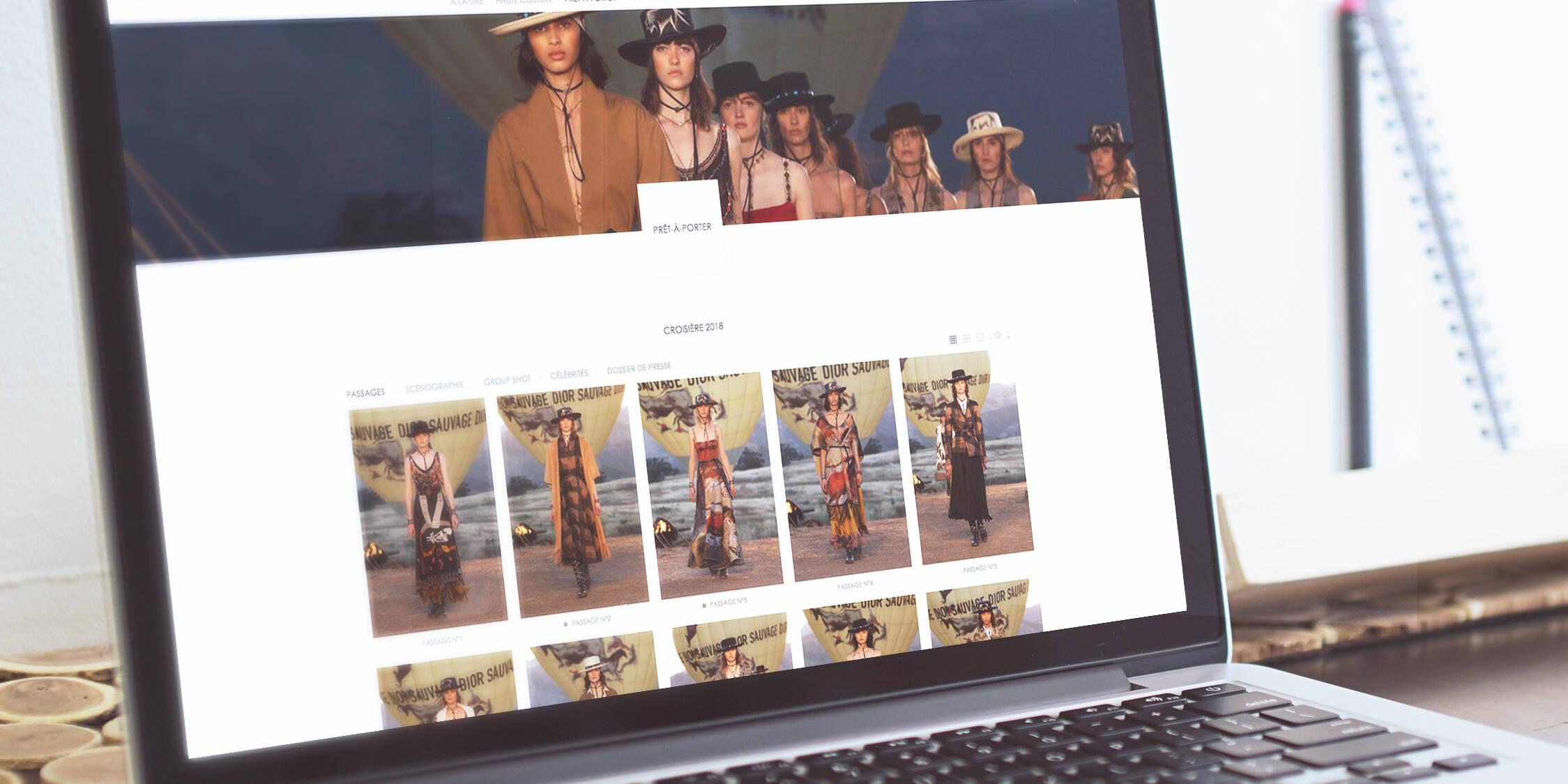
The first design direction relied heavily on established luxury codes: refined imagery, minimalist layouts and highly polished product presentation.
But user feedback revealed an unexpected problem. Some customers assumed they were looking at new luxury products and perceived the prices as inaccessible.
The visual language was creating a disconnect between the brand and its actual proposition: authenticated pre-owned pieces at significantly lower prices.
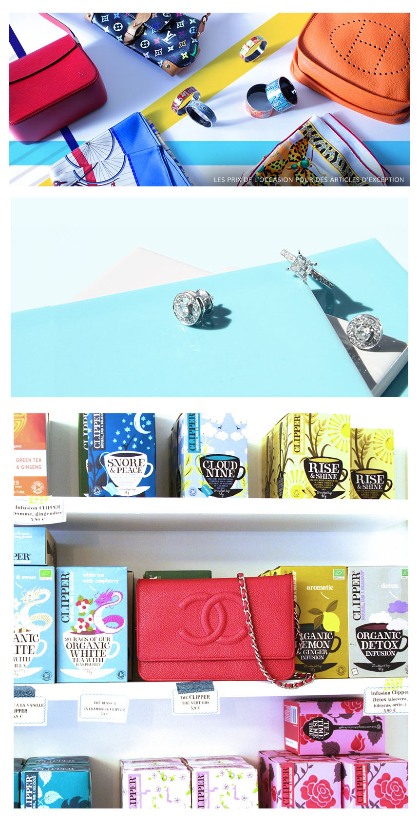
We therefore began exploring a different narrative — less about reproducing the codes of traditional luxury retail, and more about the experience of discovering unique pieces and finding something rare.
Design became a way of clarifying the value proposition, not simply expressing it.
Designing from actual usage
As the platform evolved, analytics and user behaviour also challenged some of our assumptions.
We discovered that the homepage received far less traffic than expected, while catalogue and product pages were much stronger entry points.
Rather than continuing to invest heavily in a homepage-led experience, we shifted our attention towards the areas where users were actually discovering products.
The purchasing journey also revealed significant drop-off. Marketing teams ran A/B tests around elements such as CTA positioning, while I translated these requirements into visual and interface explorations.
This was an important lesson early in my career: good design decisions are not always the most visually exciting ones.

Designing for a multi-sided marketplace
The platform had to serve very different users.
Buyers were looking for inspiration, reassurance and rare finds. Sellers had very different needs depending on whether they were individuals or professional resellers.
The platform therefore had to balance multiple journeys, from product discovery and purchase to listing, authentication and resale.
This complexity influenced both the information architecture and the way we thought about the overall user experience.
Content production was another challenge.
Products moved through the company very quickly: once sold, they were authenticated and shipped, leaving very little time to create campaign assets.
Yet marketing needed a constant flow of content for newsletters, seasonal campaigns and commercial events.
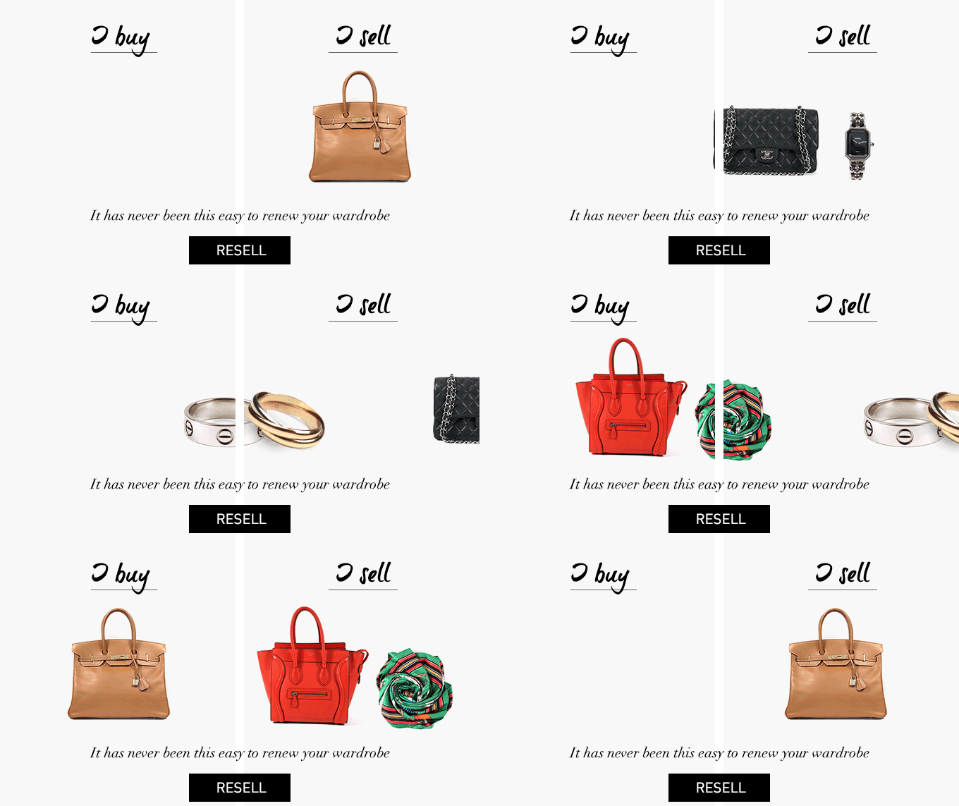
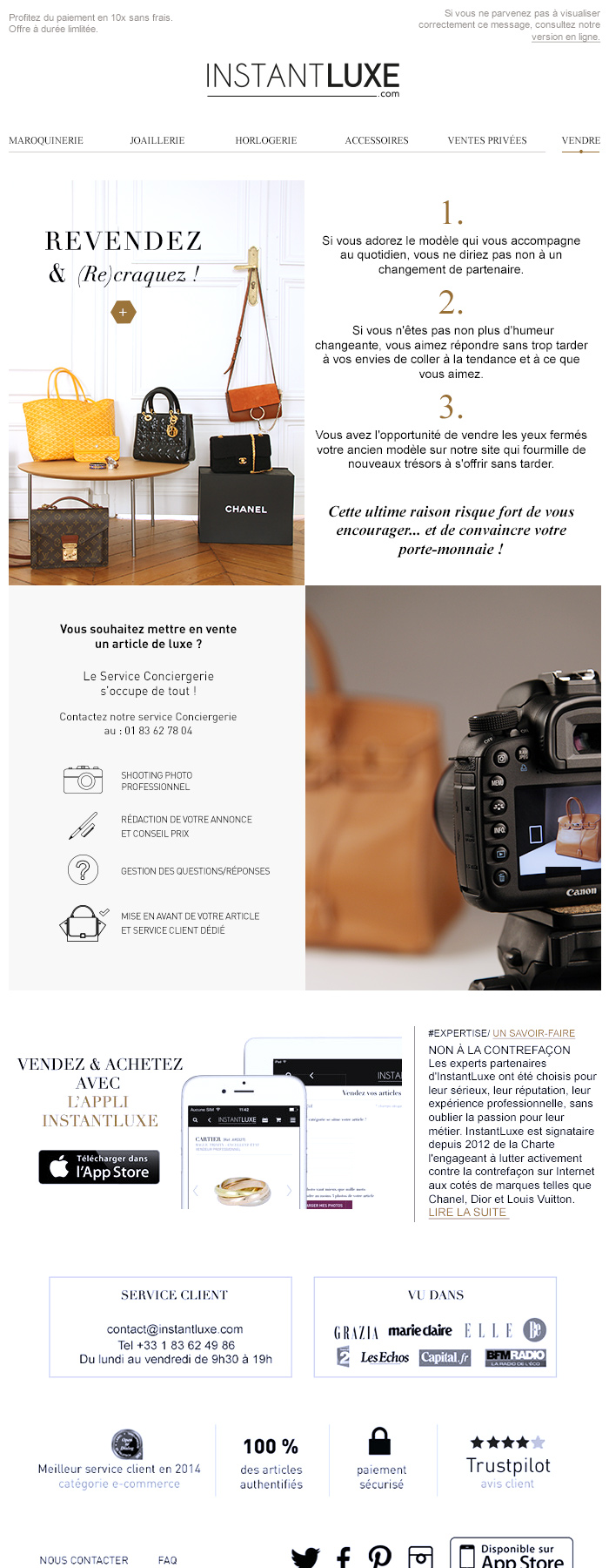
I helped develop a visual content workflow combining product photography, image archiving and dedicated shoots, allowing the brand to maintain a consistent visual identity without relying on products being physically available for long periods.
This content system became an essential part of keeping the digital experience visually rich while working within the constraints of a resale marketplace.
Designing for user-generated content
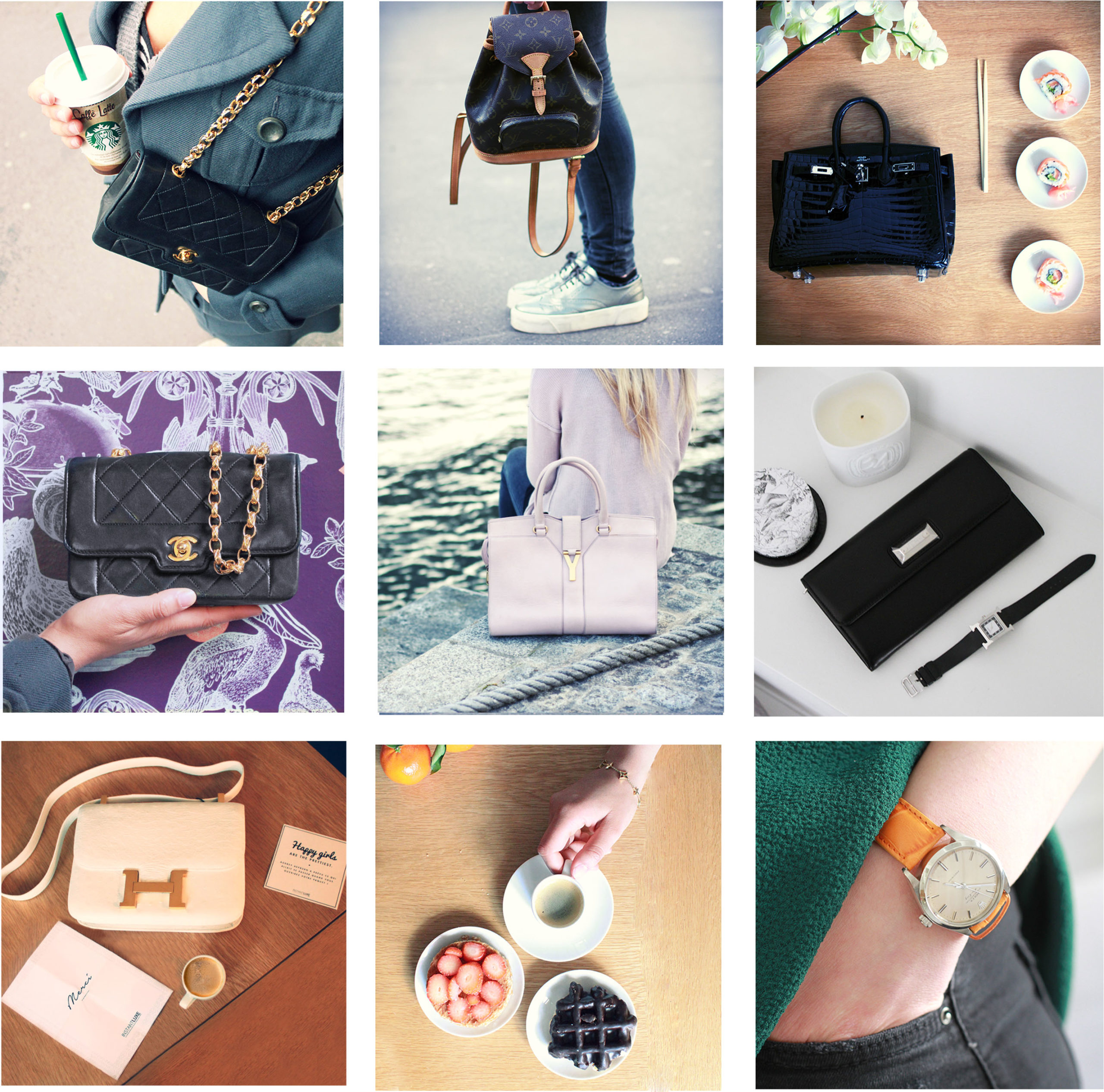
One of the biggest challenges was the quality of seller-generated photography. Images were often far below the visual standards expected for a luxury marketplace, directly affecting product perception and the overall experience.
We approached this as a user experience challenge. The first product image was systematically retouched and isolated on a white background, while we created simple editorial guidelines and video tutorials to help sellers improve their photography.
For high-volume professional sellers, we also provided photography support when needed.
The results were visible: image quality improved significantly, particularly among professional sellers, making the catalogue more consistent and products more appealing.
This experience taught me that improving a digital experience sometimes means designing the behaviours around the interface, not just the interface itself.
The first major redesign also marked the transition towards a truly responsive experience.
We adapted the platform for desktop, tablet and mobile, while paying particular attention to tablet usage, which was surprisingly significant among our customers at the time.
The redesign was not only visual. It involved reconsidering navigation, catalogue discovery, product pages and the purchasing journey based on emerging usage patterns.
This project shaped the way I approach digital design today.
The redesign was followed by a significant increase in business performance. According to the figures shared internally at the time, revenue reportedly tripled following the redesign.
The company continued to grow and was subsequently acquired by the Galeries Lafayette Group.
Working in a small, cross-functional team meant seeing the direct relationship between design, technology, marketing and business decisions. It taught me to question assumptions, look at actual user behaviour and understand when visual design supports the experience — and when it gets in the way.
It was also where I first experienced the complexity of designing for a marketplace: different users, different motivations, constantly changing content and a brand proposition that had to evolve alongside the market itself.